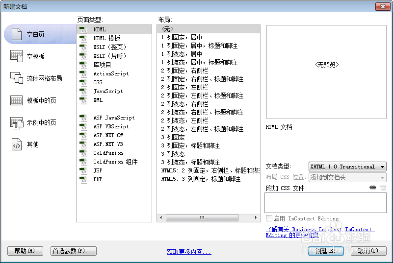
1、新建html文档。
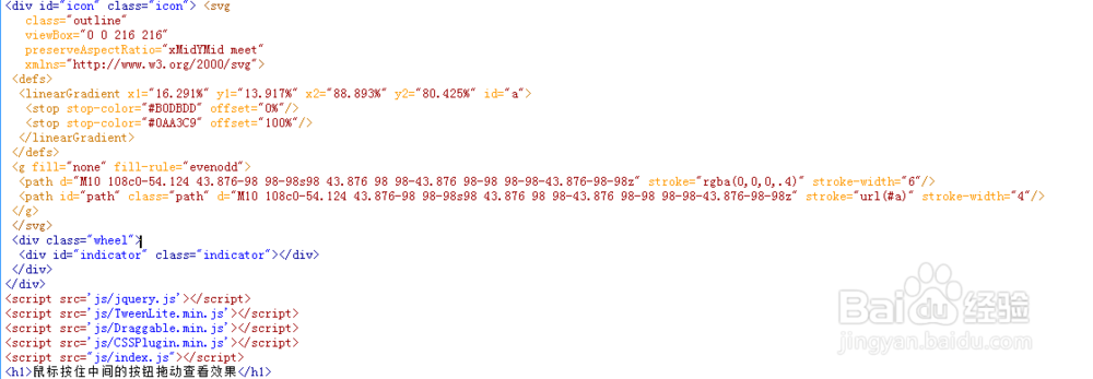
2、书写hmtl代码。
<div id="icon" class="icon"> <svg
class="outline"
viewBox="0 0 216 216"
preserveAspectRatio="xMidYMid meet" >
<defs>
<linearGradient x1="16.291%" y1="13.917%" x2="88.893%" y2="80.425%" id="a">
<stop stop-color="#B0DBDD" offset="0%"/>
<stop stop-color="#0AA3C9" offset="100%"/>
</linearGradient>
</defs>
<g fill="none" fill-rule="evenodd">
<path d="M10 108c0-54.124 43.876-98 98-98s98 43.876 98 98-43.876 98-98 98-98-43.876-98-98z" stroke="rgba(0,0,0,.4)" stroke-width="6"/>
<path id="path" class="path" d="M10 108c0-54.124 43.876-98 98-98s98 43.876 98 98-43.876 98-98 98-98-43.876-98-98z" stroke="url(#a)" stroke-width="4"/>
</g>
</svg>
<div class="wheel">
<div id="indicator" class="indicator"></div>
</div>
</div>
<h1>鼠标按住中间的按钮拖动查看效果</h1>
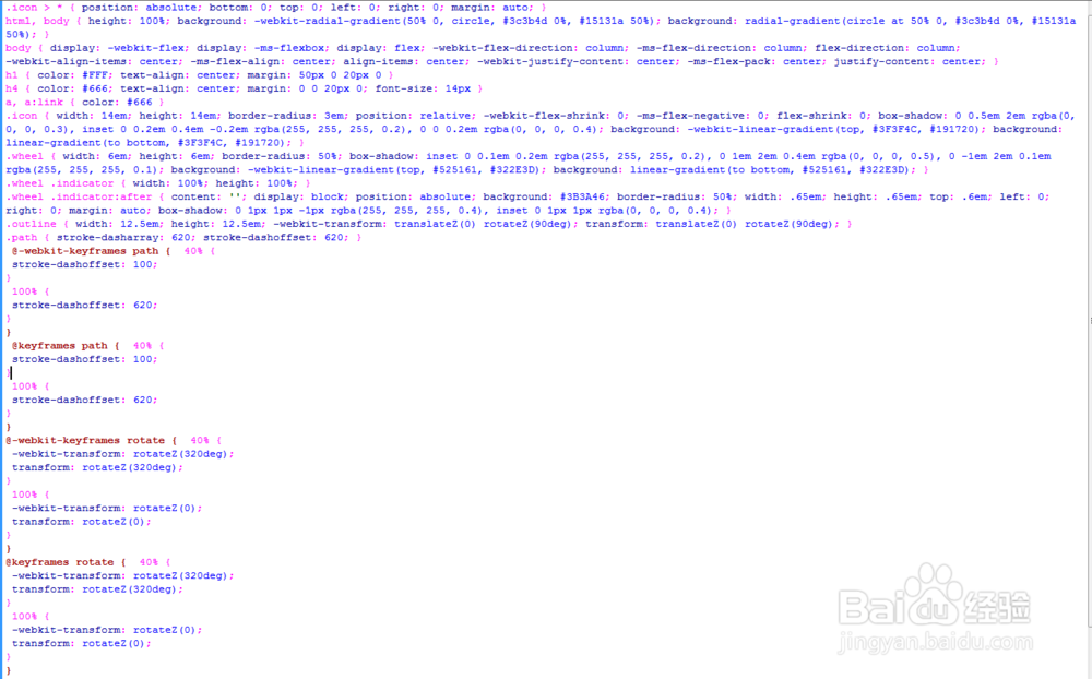
3、书写css代码。
.icon > * { position: absolute; bottom: 0; top: 0; left: 0; right: 0; margin: auto; }
html, body { height: 100%; background: -webkit-radial-gradient(50% 0, circle, #3c3b4d 0%, #15131a 50%); background: radial-gradient(circle at 50% 0, #3c3b4d 0%, #15131a 50%); }
body { display: -webkit-flex; display: -ms-flexbox; display: flex; -webkit-flex-direction: column; -ms-flex-direction: column; flex-direction: column; -webkit-align-items: center; -ms-flex-align: center; align-items: center; -webkit-justify-content: center; -ms-flex-pack: center; justify-content: center; }
h1 { color: #FFF; text-align: center; margin: 50px 0 20px 0 }
h4 { color: #666; text-align: center; margin: 0 0 20px 0; font-size: 14px }
a, a:link { color: #666 }
.icon { width: 14em; height: 14em; border-radius: 3em; position: relative; -webkit-flex-shrink: 0; -ms-flex-negative: 0; flex-shrink: 0; box-shadow: 0 0.5em 2em rgba(0, 0, 0, 0.3), inset 0 0.2em 0.4em -0.2em rgba(255, 255, 255, 0.2), 0 0 0.2em rgba(0, 0, 0, 0.4); background: -webkit-linear-gradient(top, #3F3F4C, #191720); background: linear-gradient(to bottom, #3F3F4C, #191720); }
.wheel { width: 6em; height: 6em; border-radius: 50%; box-shadow: inset 0 0.1em 0.2em rgba(255, 255, 255, 0.2), 0 1em 2em 0.4em rgba(0, 0, 0, 0.5), 0 -1em 2em 0.1em rgba(255, 255, 255, 0.1); background: -webkit-linear-gradient(top, #525161, #322E3D); background: linear-gradient(to bottom, #525161, #322E3D); }
.wheel .indicator { width: 100%; height: 100%; }
.wheel .indicator:after { content: ''; display: block; position: absolute; background: #3B3A46; border-radius: 50%; width: .65em; height: .65em; top: .6em; left: 0; right: 0; margin: auto; box-shadow: 0 1px 1px -1px rgba(255, 255, 255, 0.4), inset 0 1px 1px rgba(0, 0, 0, 0.4); }
.outline { width: 12.5em; height: 12.5em; -webkit-transform: translateZ(0) rotateZ(90deg); transform: translateZ(0) rotateZ(90deg); }
.path { stroke-dasharray: 620; stroke-dashoffset: 620; }
@-webkit-keyframes path { 40% {
stroke-dashoffset: 100;
}
100% {
stroke-dashoffset: 620;
}
}
@keyframes path { 40% {
stroke-dashoffset: 100;
}
100% {
stroke-dashoffset: 620;
}
}
@-webkit-keyframes rotate { 40% {
-webkit-transform: rotateZ(320deg);
transform: rotateZ(320deg);
}
100% {
-webkit-transform: rotateZ(0);
transform: rotateZ(0);
}
}
@keyframes rotate { 40% {
-webkit-transform: rotateZ(320deg);
transform: rotateZ(320deg);
}
100% {
-webkit-transform: rotateZ(0);
transform: rotateZ(0);
}
}
.path { -webkit-animation: path 2s; animation: path 2s; }
.indicator { -webkit-animation: rotate 2s; animation: rotate 2s; }
4、书写index.js并添加js代码。
<script src='js/jquery.js'></script>
<script src='js/TweenLite.min.js'></script>
<script src='js/Draggable.min.js'></script>
<script src='js/CSSPlugin.min.js'></script>
<script src="js/index.js"></script>
<script>
var path = $('#path');
Draggable.create("#indicator", {
type: "rotation",
throwProps: true,
maxRotation: 360,
onDrag: function() {
var i = this.rotation;
path.css('stroke-dashoffset', 620*(1-i/360));
},
});</script>

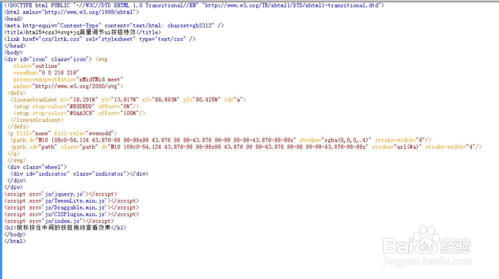
5、代码整体结构。
6、 查看效果。
