
3、书写hmtl代码。
<style>
input { transition: all 0.30s ease-in-out; -webkit-transition: all 0.30s ease-in-out; -moz-transition: all 0.30s ease-in-out; border: #35a5e5 1px solid; border-radius: 3px; outline: none; }
input:focus { box-shadow: 0 0 5px rgba(81, 203, 238, 1); -webkit-box-shadow: 0 0 5px rgba(81, 203, 238, 1); -moz-box-shadow: 0 0 5px rgba(81, 203, 238, 1); }
a { text-decoration: none; background: rgba(81, 203, 238, 1); color: white; padding: 6px 25px 6px 25px; font: 12px '微软雅黑'; border-radius: 3px; -webkit-transition: all linear 0.30s; -moz-transition: all linear 0.30s; transition: all linear 0.30s; }
a:hover { background: rgba(39, 154, 187, 1); }
</style>

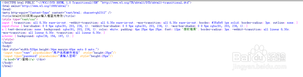
4、整体代码结构
5、查看效果
