1、新建html文档。
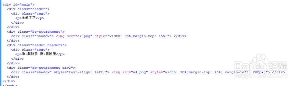
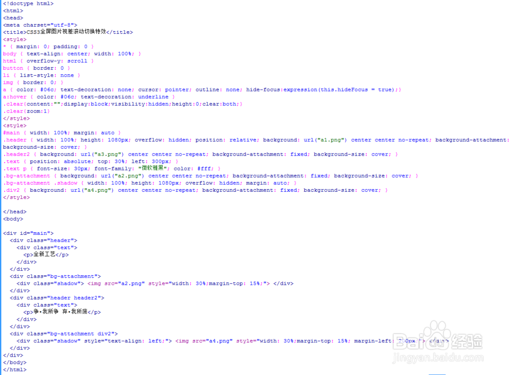
2、书写hmtl代码。
<div id="main">
<div class="header">
<div class="text">
全新工艺
</div>
</div>
<div class="bg-attachment">
<div class="shadow"> <img src="a2.png" style="width: 30%;margin-top: 15%;"> </div>
</div>
<div class="header header2">
<div class="text">
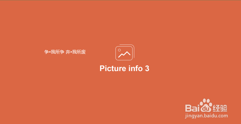
争•我所争 弃•我所废
</div>
</div>
<div class="bg-attachment div2">
<div class="shadow" style="text-align: left;"> <img src="a4.png" style="width: 30%;margin-top: 15%; margin-left: 200px;"> </div>
</div>
</div>
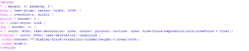
3、初始化css代码。
<style>
* { margin: 0; padding: 0 }
body { text-align: center; width: 100%; }
html { overflow-y: scroll }
button { border: 0 }
li { list-style: none }
img { border: 0; }
a { color: #06c; text-decoration: none; cursor: pointer; outline: none; hide-focus:expression(this.hideFocus = true);}
a:hover { color: #06c; text-decoration: underline }
.clear{content:"";display:block;visibility:hidden;height:0;clear:both;}
.clear{zoom:1}
</style>
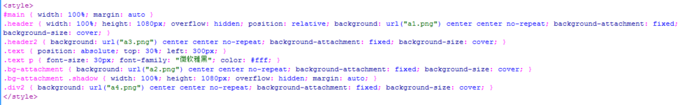
4、书写css代码。
<style>
#main { width: 100%; margin: auto }
.header { width: 100%; height: 1080px; overflow: hidden; position: relative; background: url("a1.png") center center no-repeat; background-attachment: fixed; background-size: cover; }
.header2 { background: url("a3.png") center center no-repeat; background-attachment: fixed; background-size: cover; }
.text { position: absolute; top: 30%; left: 300px; }
.text p { font-size: 30px; font-family: "微软雅黑"; color: #fff; }
.bg-attachment { background: url("a2.png") center center no-repeat; background-attachment: fixed; background-size: cover; }
.bg-attachment .shadow { width: 100%; height: 1080px; overflow: hidden; margin: auto; }
.div2 { background: url("a4.png") center center no-repeat; background-attachment: fixed; background-size: cover; }
</style>
5、代码整体结构。
6、查看效果。