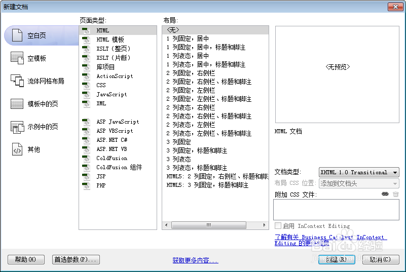
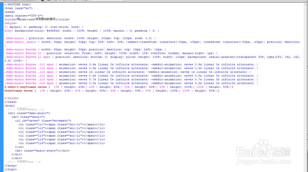
1、新建html文档。
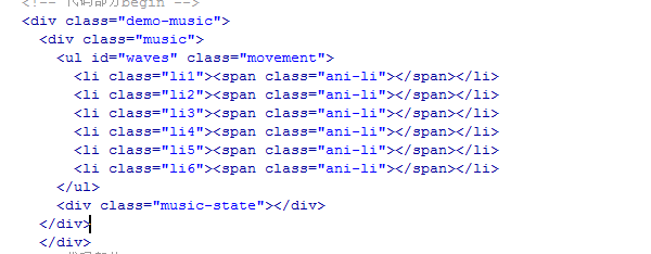
2、书写hmtl代码。
<div class="demo-music">
<div class="music">
<ul id="waves" class="movement">
<li class="li1"><span class="ani-li"></span></li>
<li class="li2"><span class="ani-li"></span></li>
<li class="li3"><span class="ani-li"></span></li>
<li class="li4"><span class="ani-li"></span></li>
<li class="li5"><span class="ani-li"></span></li>
<li class="li6"><span class="ani-li"></span></li>
</ul>
<div class="music-state"></div>
</div>
</div>
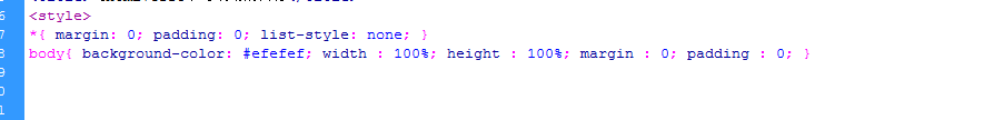
3、初始化css代码。
<style>
*{ margin: 0; padding: 0; list-style: none; }
body{ background-color: #efefef; width : 100%; height : 100%; margin : 0; padding : 0; }
</style>
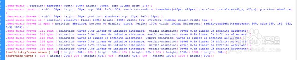
4、书写css代码。
.demo-music { position: absolute; width: 100%; height: 200px; top: 120px; zoom: 1.5; }
.demo-music .music { width: 80px; height: 50px; top: 50%; left: 50%; -webkit-transform: translate(-40px, -25px); transform: translate(-40px, -25px); position: absolute; }
.demo-music #waves { width: 80px; height: 50px; position: absolute; top: 12px; left: 12px; }
.demo-music #waves li { position: relative; float: left; height: 100%; width: 12%; overflow: hidden; margin-right: 1px; }
.demo-music #waves li span { position: absolute; bottom: 0; display: block; height: 100%; width: 100px; background: radial-gradient(transparent 50%, rgba(255, 162, 162, 0.9) 100%); }
.demo-music #waves .li1 span { animation: waves 0.6s linear 0s infinite alternate; -webkit-animation: waves 0.6s linear 0s infinite alternate; }
.demo-music #waves .li2 span { animation: waves 0.9s linear 0s infinite alternate; -webkit-animation: waves 0.9s linear 0s infinite alternate; }
.demo-music #waves .li3 span { animation: waves 1s linear 0s infinite alternate; -webkit-animation: waves 1s linear 0s infinite alternate; }
.demo-music #waves .li4 span { animation: waves 0.8s linear 0s infinite alternate; -webkit-animation: waves 0.8s linear 0s infinite alternate; }
.demo-music #waves .li5 span { animation: waves 0.7s linear 0s infinite alternate; -webkit-animation: waves 0.7s linear 0s infinite alternate; }
.demo-music #waves .li6 span { animation: waves 0.5s linear 0s infinite alternate; -webkit-animation: waves 0.5s linear 0s infinite alternate; }
@-webkit-keyframes waves { 10% { height: 20%;} 20% { height: 60%;} 40% { height: 40%;} 50% { height: 100%;} 100% { height: 50%;}}
@keyframes waves { 10% { height: 20%;} 20% { height: 60%;} 40% { height: 40%;} 50% { height: 100%;} 100% { height: 50%;}}
5、代码整体结构。
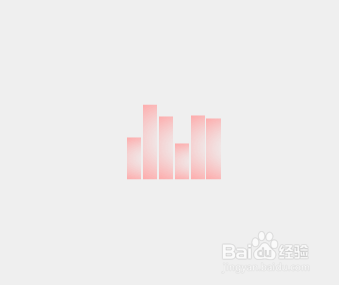
6、查看效果。