1、HTML 我们将创建一个列表项,并为每个菜单链接的锚标记无序列表。若要创建子菜单添加另一个无序列表内的名单。<ul class="menu"> <li><a href="http://www.web0752.com/">网站建设</a></li> <li><a href="http://www.web0752.com/">网站制作</a></li> <li><a href="http://www.web0752.com/">网站优化</a></li> <ul> <li><a href="#" class="documents">Documents</a></li> <li><a href="#" class="messages">Messages</a></li> <li><a href="#" class="signout">Sign Out</a></li> </ul> </li> <li><a href="#">Uploads</a></li> <li><a href="#">Videos</a></li> <li><a href="#">Documents</a></li></ul>

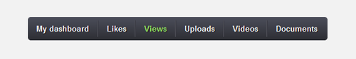
3、菜单布局我们先把菜单中的所有元素移除。然后,我们将增加一个固定的宽度和高度,圆角有CSS3梯度的菜单。为了让链接水平对齐,我们让列表左浮动。我们还需要设置它为相对位置,因为我们需要对齐子菜单。.menu,.menu ul,.menu li,.menu a { margin: 0; padding: 0; border: none; outline: none;}.menu { height: 40px; width: 505px; background: #4c4e5a; background: -webkit-linear-gradient(top, #4c4e5a 0%,#2c2d33 100%); background: -moz-linear-gradient(top, #4c4e5a 0%,#2c2d33 100%); background: -o-linear-gradient(top, #4c4e5a 0%,#2c2d33 100%); background: -ms-linear-gradient(top, #4c4e5a 0%,#2c2d33 100%); background: linear-gradient(top, #4c4e5a 0%,#2c2d33 100%); -webkit-border-radius: 5px; -moz-border-radius: 5px; border-radius: 5px;}.menu li { position: relative; list-style: none; float: left; display: block; height: 40px;}我们将暂时隐藏子菜单,以更容易的定义第一级菜单。.menu ul { display: none; }
5、菜单链接首先给菜单加一些基本的CSS样式如字体,颜色等,然后我们将添加一个黑暗的文字阴影和过渡色来创建一个悬停状态时颜色变化平滑的效果。加一个左边框和右边框来做链接分隔,去掉第一个和最后一个项的左边框和右边框。悬停状态效果,只需要改变字体颜色。 .menu li a { display: block; padding: 0 14px; margin: 6px 0; line-height: 28px; text-decoration: none; border-left: 1px solid #393942; border-right: 1px solid #4f5058; font-family: Helvetica, Arial, sans-serif; font-weight: bold; font-size: 13px; color: #f3f3f3; text-shadow: 1px 1px 1px rgba(0,0,0,.6); -webkit-transition: color .2s ease-in-out; -moz-transition: color .2s ease-in-out; -o-transition: color .2s ease-in-out; -ms-transition: color .2s ease-in-out; transition: color .2s ease-in-out;}.menu li:first-child a { border-left: none; }.menu li:last-child a{ border-right: none; }.menu li:hover > a { color: #8fde62; }
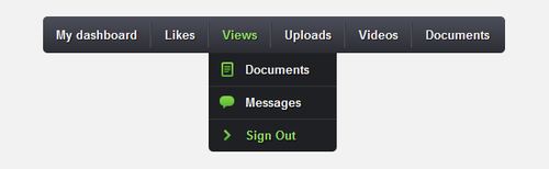
7、子菜单首先,我们先删除第二步加的这行代码。.menu ul { display: none; } 现在,我们给子菜单定义样式。给子菜单定位离顶部40px,左侧0px,差加底部圆角。我们设置不透视度为0,悬停状态为1来做一个淡入淡出的效果。对于切片上下切换的效果,我们需要设置列表的高度0px时是隐藏36px悬停状态。 .menu ul { position: absolute; top: 40px; left: 0; opacity: 0; background: #1f2024; -webkit-border-radius: 0 0 5px 5px; -moz-border-radius: 0 0 5px 5px; border-radius: 0 0 5px 5px; -webkit-transition: opacity .25s ease .1s; -moz-transition: opacity .25s ease .1s; -o-transition: opacity .25s ease .1s; -ms-transition: opacity .25s ease .1s; transition: opacity .25s ease .1s;}.menu li:hover > ul { opacity: 1; }.menu ul li { height: 0; overflow: hidden; padding: 0; -webkit-transition: height .25s ease .1s; -moz-transition: height .25s ease .1s; -o-transition: height .25s ease .1s; -ms-transition: height .25s ease .1s; transition: height .25s ease .1s;}.menu li:hover > ul li { height: 36px; overflow: visible; padding: 0;}我们将设置子菜单链接的宽度为100px。.menu ul li a { width: 100px; padding: 4px 0 4px 40px; margin: 0; border: none; border-bottom: 1px solid #353539;}.menu ul li:last-child a { border: none; } 现在,我们只需要添加图标和子菜单链接来完成它。要做到这点,我们只要自定义一个类,差加背景图片。.menu a.documents { background: url(../img/docs.png) no-repeat 6px center; }.menu a.messages { background: url(../img/bubble.png) no-repeat 6px center; }.menu a.signout { background: url(../img/arrow.png) no-repeat 6px center; }