1、一、水平居中(text-align:center;)
这个属性在没有浮动的情况下,我们可以将块级元素转换为inline/inline-block,然后其父元素加上text-align:center;属性就可以将其居中。如果是行内元素(比如span、img、a等)直接在父元素上添加text-align:center;属性即可。


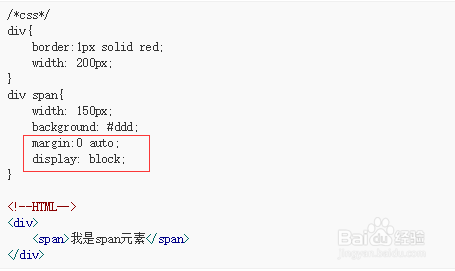
2、二、使用margin:0 auto;水平居中
前提:给元素设定了宽度和具有display:block;的块级元素。
让一个DIV水平居中,只要设置了DIV的宽度,然后使用margin:0 auto,css自动算出左右边距,使得DIV居中。
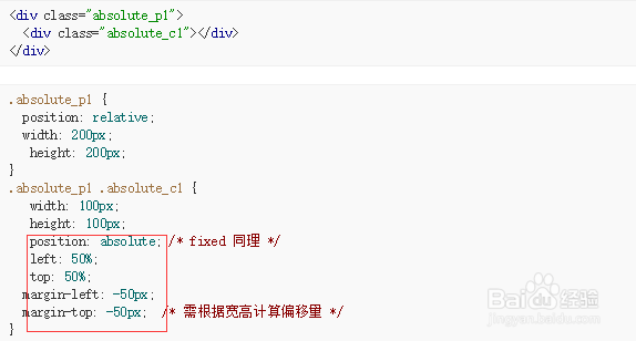
3、三、定位实现居中(需计算偏移值)
原理: 通过定位使元素左上角居中,再通过偏移值margin调整使元素中心居中。 缺点:高度宽度需事先知道。
<div class="absolute_p1">
<div class="absolute_c1"></div>
</div>
.absolute_p1 {
position: relative;
width: 200px;
height: 200px;}
.absolute_p1 .absolute_c1 {
width: 100px;
height: 100px;
position: absolute; /* fixed 同理 */
left: 50%; top: 50%;
margin-left: -50px;
margin-top: -50px; /* 需根据宽高计算偏移量 */}
该方法普遍使用,但是前提必须知道元素的宽度和高度。如果当页面的宽高是动态的,比方说页面需要弹出一个DIV层必须要居中显示,DIV的内容是动态的,所以宽高也是动态的,这是可以用jquery解决居中。
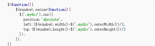
4、四、jquery实现水平和垂直居中。
jquery实现水平和垂直剧中的原理是通过jquery设置div的css,获取div的左,上的边距偏移量,边距偏移量的算法就是用页面窗口的宽度减去该div的宽度,得到的值再除以2即左偏移量,右偏移量算法相同。注意div的css设置要在resize()方法中完成,就是每次改变窗口大小是,都要执行设置div的css,代码如下:
$(function(){
$(window).resize(function(){
$('.mydiv').css({
position:'absolute',
left:($(window).width()-$('.mydiv').outerWidth())/2,
top:($(window).height()-$('.mydiv').outerHeight())/2
});
});
})
此方法的好处就是不需要知道div 的具体宽度和高度,直接用jquery就可以实现水平和垂直居中,并且兼容各种浏览器。这个方法在很多的弹出层效果中应用。
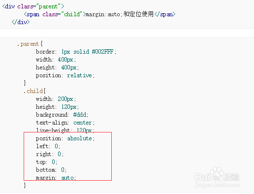
5、五、 定位实现居中(不需计算偏移值,margin:auto;和定位搭配使用)
这种方法好处是行内元素和块级元素都适用,但是需要知道元素本身的宽度。
<div class="parent">
<span class="child">margin:auto;和定位使用</span>
</div>
.parent{
border: 1px solid #002FFF;
width: 400px;
height: 400px;
position: relative;
}
.child{
width: 200px;
height: 120px;
background: #ddd;
text-align: center;
line-height: 120px;
position: absolute;
left: 0;
right: 0;
top: 0;
bottom: 0;
margin: auto;
}
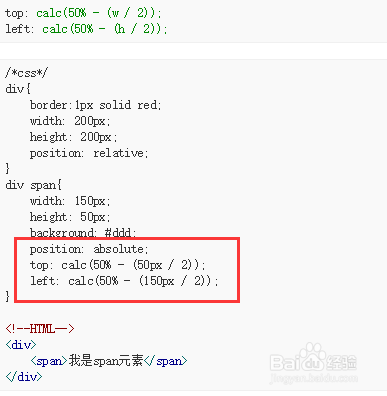
6、六、calc和定位的组合使用
calc是英文单词calculate(计算)的缩写,是css3的一个新增的功能,你可以使用calc()给元素的border、margin、pading、font-size和width等属性设置动态值。
以前我们可以使用box-sizing:border-box;来设置盒子的属性为不加上边距。现在我们又多了一个选择了。但要注意,两者只能使用一个哦,否则就会造成冲突了。
calc使元素居中的原理和负margin是一样的,calc 允许你基于当前的页面布局计算尺寸。在上面的简单计算中, 50% 是容器元素的中心点,但是如果只设置50%会使图片的左上角对齐div的中心位置。 我们需要把图片向左和向上各移动图片宽高的一半。计算公式为:
top: calc(50% - (w / 2));
left: calc(50% - (h / 2));
/*css*/
div{
border:1px solid red;
width: 200px;
height: 200px;
position: relative;
}
div span{
width: 150px;
height: 50px;
background: #ddd;
position: absolute;
top: calc(50% - (50px / 2));
left: calc(50% - (150px / 2));
}
<!--HTML-->
<div>
<span>我是span元素</span>
</div>
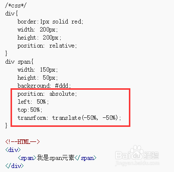
7、七、使用css3的新属性transform:translate(x,y)属性
这个方法可以不需要设定固定的宽高,在移动端用的会比较多,在移动端css3兼容的比较好
原理: 通过定位使元素左上角居中,再通过 translate 位移元素使之中心居中,由于 translate支持百分比,所以也就不用自己算偏移量了
8、八、使用flex居中
使用flex居中不需要知道元素本身宽高以及元素的属性。
/*css*/
div{
border:1px solid red;
width: 200px;
height: 200px;
display: flex;
justify-content: center;/* 水平居中*/
align-items: center;/* 垂直居中*/
}
div span{
background: #ddd;
}
<!--HTML-->
<div>
<span>我是span元素</span>
</div>
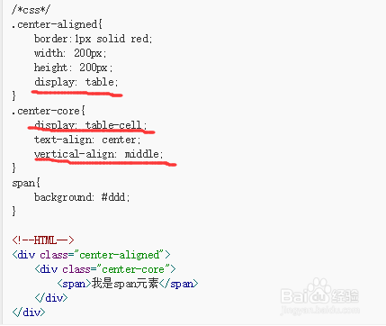
9、九、使用table-cell居中
使用 display: table-cell, 而不是使用table标签; 可以实现水平居中和垂直居中,但是这种方法需要添加额外的元素作为外部容器。
/*css*/
.center-aligned{
border:1px solid red;
width: 200px;
height: 200px;
display: table;
}
.center-core{
display: table-cell;
text-align: center;
vertical-align: middle;
}
span{
background: #ddd;
}
<!--HTML-->
<div class="center-aligned">
<div class="center-core">
<span>我是span元素</span>
</div>
</div>