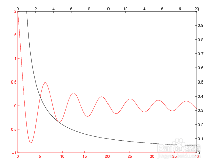
1、plotyy(X1,Y1,X2,Y2)
在左侧绘制X1与Y1之间的关系,左侧标记y轴;
右在侧绘制X2与Y2之间的关系,右侧标记y轴。
For example,
plotyy(x1,y1,x2,y2,@loglog) % function handle
plotyy(x1,y1,x2,y2,'loglog') % string
plotyy(X1,Y1,X2,Y2,'function1','function2')使用函数1(X1,Y1)绘制左轴数据和函数2(X2,Y2)绘制右轴数据
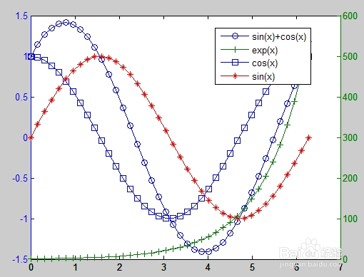
2、这个例子使用绘图作为绘图函数来绘制两个数学函数。 即使数据的相对值差别很大,两个y轴也可以在一个图表上显示两组数据。
figure
x = 0:0.01:20;
y1 = 200*exp(-0.05*x).*sin(x);
y2 = 0.8*exp(-0.5*x).*sin(10*x);
[AX,H1,H2] = plotyy(x,y1,x,y2,'plot');
set(get(AX(1),'Ylabel'),'String','Slow Decay')
set(get(AX(2),'Ylabel'),'String','Fast Decay')
xlabel('Time (\musec)')
title('Multiple Decay Rates')
set(H1,'LineStyle','--')
set(H2,'LineStyle',':')
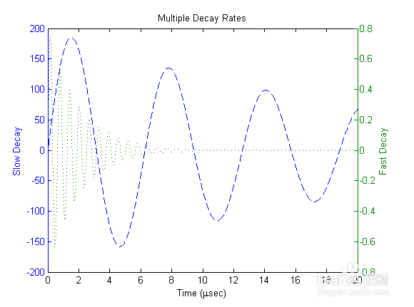
3、这个例子使用绘图作为绘图函数来绘制两个数学函数。 即使数据的相对值差别很大,两个y轴也可以在一个图表上显示两组数据。
% 程序2:x=linspace(0,2*pi,40);[ax,h1,h2]=plotyy(x,sin(x)+cos(x),x,exp(x));
set(h1,'linestyle','-')set(h2,'linestyle','-')set(h1,'marker','o')set(h2,'marker','+')hold onx=linspace(0,2*pi,40);hh=line(x,cos(x));set(hh,'linestyle','-')set(hh,'marker','s')
hold onhhf=line(x,sin(x));set(hhf,'color','r')set(hhf,'linestyle','-')set(hhf,'marker','*')legend([h1,h2,hh,hhf],'sin(x)+cos(x)','exp(x)','cos(x)','sin(x)',0);
1、 两个x轴两个y轴
这个例子创建一个图形来显示两组独立的数据,分别使用底部和左侧作为一个的x轴和y轴,顶部和右侧作为另一个的x轴和y轴。
x1 = [0:.1:40];
y1 = 4.*cos(x1)./(x1+2);
x2 = [1:.2:20];
y2 = x2.^2./x2.^3;
使用低级线和轴例程可以轻松地叠加对象。 绘制第一个数据,使线的颜色和相应的x轴和y轴相同,从而更容易地将它们关联起来
hl1 = line(x1,y1,'Color','r');
ax1 = gca;
set(ax1,'XColor','r','YColor','r')
接下来,在与第一个位置相同的位置创建另一个轴,将x轴置于顶部,将y轴置于右侧。 将“轴颜色”设置为“无”,以允许第一个轴可见,并对x轴和y轴进行颜色编码以匹配数据。
ax2 = axes('Position',get(ax1,'Position'),...
'XAxisLocation','top',...
'YAxisLocation','right',...
'Color','none',...
'XColor','k','YColor','k');
用与x轴和y轴相同的颜色绘制第二组数据。
hl2 = line(x2,y2,'Color','k','Parent',ax2);
完整程序如下:
x1 = [0:.1:40];
y1 = 4.*cos(x1)./(x1+2);
x2 = [1:.2:20];
y2 = x2.^2./x2.^3;
hl1 = line(x1,y1,'Color','r');
ax1 = gca;
set(ax1,'XColor','r','YColor','r')
ax2 = axes('Position',get(ax1,'Position'),...
'XAxisLocation','top',...
'YAxisLocation','right',...
'Color','none',...
'XColor','k','YColor','k');
hl2 = line(x2,y2,'Color','k','Parent',ax2);
所得图形结果如右图所示:
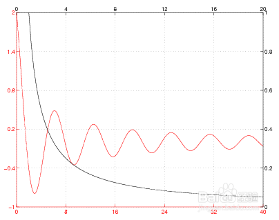
1、由于这两个轴是完全独立的,因此MATLAB软件根据每个绘制的数据确定刻度标记位置。 网格线不太可能重合。 这会产生一个令人困惑的图表,即使这两个网格用不同的颜色绘制。 但是,如果您手动指定刻度线位置,则可以使网格重合
完整程序如下:
x1 = [0:.1:40];
y1 = 4.*cos(x1)./(x1+2);
x2 = [1:.2:20];
y2 = x2.^2./x2.^3;
hl1 = line(x1,y1,'Color','r');
ax1 = gca;
set(ax1,'XColor','r','YColor','r')
ax2 = axes('Position',get(ax1,'Position'),...
'XAxisLocation','top',...
'YAxisLocation','right',...
'Color','none',...
'XColor','k','YColor','k');
hl2 = line(x2,y2,'Color','k','Parent',ax2);
%% 手动指定刻度线位置
xlimits = get(ax1,'XLim');
ylimits = get(ax1,'YLim');
xinc = (xlimits(2)-xlimits(1))/5;
yinc = (ylimits(2)-ylimits(1))/5;
set(ax1,'XTick',[xlimits(1):xinc:xlimits(2)],...
'YTick',[ylimits(1):yinc:ylimits(2)])
所得图形结果如右图所示: